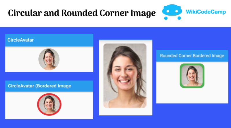
How to create Circular and Rounded corner image in Flutter.
In this tutorial we will learn how to create a circular image and how to make rounded borders of image.
A circular image is an image that has a circular shape. Rather than being rectangular or square, the image is cropped or designed to fit within the confines of a circular boundary. Circular images are commonly used in web design, logos, and icons, and can create a unique visual impact due to their distinctive shape.
Circular images are commonly used as user avatars or profile pictures in apps that involve social interactions, such as social media, messaging, and dating apps. They can help users identify and differentiate each other and create a more personal and engaging experience.
Circular images can be used as action buttons or shortcuts in apps that have common actions or tasks, such as taking a photo, sending a message, or playing a song. They can provide a more interactive and appealing way for users to perform actions.
Circular images can be used as app icons on the home screen or app launcher. They can help the app stand out among other apps and convey the brand or theme of the app.
There are many ways to create a circular image in flutter
Create Circular image using CircleAvatar
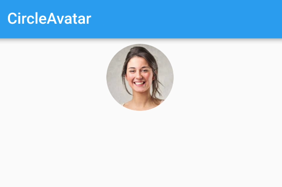
Let’s see how to create circular image using CircleAvatar Widget.
CircleAvatar(
  radius: 48, // Image radius
  backgroundImage: NetworkImage(
      'https://encrypted-tbn0.gstatic.com/images?q=tbn:ANd9GcRch6CDHA9hqbe3GbIo6O0T-EWeIL7JJ8_cpQ&usqp=CAU'),
)
Here we just used CircleAvatar widget with radius. This is the simplest solution for creating circular image in Flutter.
Output
Create Circular image using ClipOval
Now let’s achieve the same result using ClipOval Widget.
ClipOval(
  child: SizedBox.fromSize(
    size: Size.fromRadius(48), // Image radius
    child: Image.network('https://encrypted-tbn0.gstatic.com/images?q=tbn:ANd9GcRch6CDHA9hqbe3GbIo6O0T-EWeIL7JJ8_cpQ&usqp=CAU', fit: BoxFit.cover),
  ),
)
Output

Circular image with border
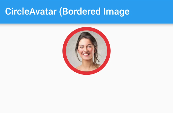
Now we will create circular image with border.
Using CircleAvatar
CircleAvatar(
  radius: 56,
  backgroundColor: Colors.red,
  child: Padding(
    padding: const EdgeInsets.all(8), // Border radius
    child: ClipOval(child: Image.network(imageUrl)),
  ),
)
Output
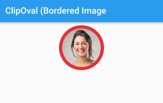
Using ClipOval
Container(

  padding: EdgeInsets.all(8), // Border width

  decoration: BoxDecoration(color: Colors.red, shape: BoxShape.circle),

  child: ClipOval(

    child: SizedBox.fromSize(

      size: Size.fromRadius(48), // Image radius

      child: Image.network(imageUrl, fit: BoxFit.cover),

    ),

  ),

)
Output
Rounded Corner Image
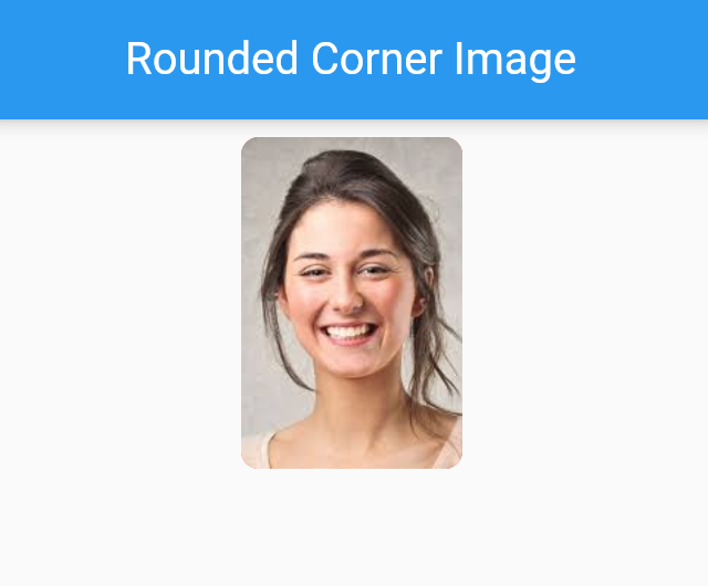
For creating rounded corners of image, we will use only container widget. This Container widget will be decorated using BoxDecoration. BoxDecoration contains an image property. In which we will provide DecorationImage for Network image. For rounded corners, we will use borderRadius property of BoxDecoration.
Container(
  width: 100.0,
  height: 150.0,
  decoration: BoxDecoration(
    image: DecorationImage(
        fit: BoxFit.cover, image: NetworkImage(imageUrl)),
    borderRadius: BorderRadius.all(Radius.circular(8.0)),
    color: Colors.redAccent,
  ),
)
Output
Rounded Bordered image
For creating border of rounded cornered image, we will use Container as parent widget. And will set background color. This color will be the border color. Set padding of this container. This padding will be the width of border. ClipRRect will be the child of this container for rounded border.
Container(
  padding: EdgeInsets.all(8), // Border width
  decoration: BoxDecoration(color: Colors.green, borderRadius: BorderRadius.circular(20)),
  child: ClipRRect(
    borderRadius: BorderRadius.circular(20),
    child: SizedBox.fromSize(
      size: Size.fromRadius(48), // Image radius
      child: Image.network(imageUrl, fit: BoxFit.cover),
    ),
  ),
)
Output

Conclusion
In this lesson we have learned many ways to create rounded and circular images. Hope this will help in your work.

