How to customise Flutter popup menu and set click listener on it.
In this tutorial we will learn how to customise flutter Popup menu and add click listener on it.
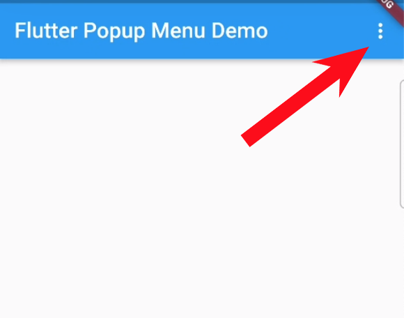
Popup menu in flutter is one of the most used widgets. It displays a menu with multiple options. Usually this is displayed by tap or long press on a widget. Popup menu is very helpful in list view, where each single item of list view requires multiples options or actions. And most common use of this widget is to show multiple options in a screen at top right corner of screen with 3 dots in AppBar, Like this.
Simple Popup Menu in Flutter
Let’s create a very simple Popup menu in App Bar, which is not difficult and takes just a few lines of code.
return Scaffold(
  appBar: AppBar(
    title: const Text('Flutter Popup Menu Demo'),
    actions: [
      PopupMenuButton(itemBuilder: (BuildContext context) {
        return [
          const PopupMenuItem(child: Text('Share')),
          const PopupMenuItem(child: Text('Upload')),
          const PopupMenuItem(child: Text('Exit'))
        ];
      })
    ],
  ),
);
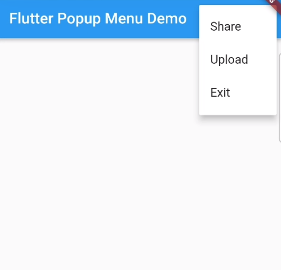
This is a simple popup menu not customized yet. Here you can see that we create popup men in Appbar of our app. Appbar widget takes a parameter ‘actions’ which is a list of widgets. In actions list we create a PopupMenuButton which takes a parameter ‘itemBuilder’, this builder creates the item in the menu. Next we return a list of PopupMenuItems. We create three menu items. Like this.
Output
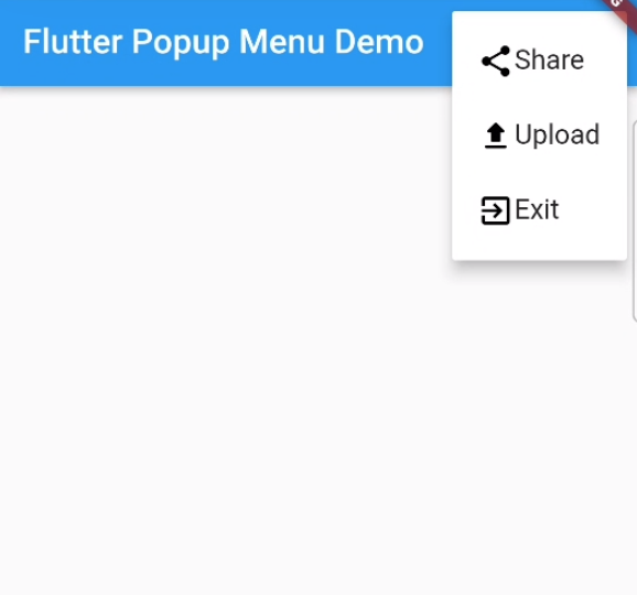
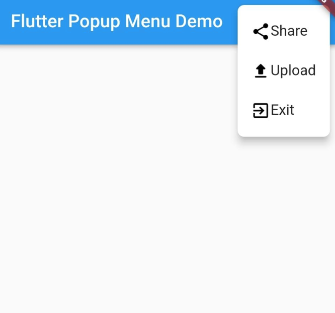
Flutter Popup Menu with Icons
As you can see that PopupMenuItem has a child property. This child can be any widget. Let’s consider we want to show icons with text in popup menu. Then we will use Row widget as a child in PopupMenuItem. And will create a Text Widget and Icon Widget in row like this.
class _MyHomePageState extends State<MyHomePage> {
  @override
  Widget build(BuildContext context) {
    return Scaffold(
      appBar: AppBar(
        title: const Text('Flutter Popup Menu Demo'),
        actions: [
          PopupMenuButton(itemBuilder: (BuildContext context) {
            return [
              _buildPopupMenuItem('Share', Icons.share),
              _buildPopupMenuItem('Upload', Icons.upload_rounded),
              _buildPopupMenuItem('Exit', Icons.exit_to_app),
             ];
          })
        ],
      ),
    );
  }

  PopupMenuItem _buildPopupMenuItem(String menuTitle, IconData iconData) {
    return PopupMenuItem(
        child: Row(
      children: [
        Icon(
          iconData,
          color: Colors.black,
        ),
        Text(menuTitle)
      ],
    ));
  }
}
Output
Rounded corners of Flutter Popup Menu
To round corners of Popup menu in Flutter we will use the shape parameter of PupupMenuButton.
PopupMenuButton(
    shape: RoundedRectangleBorder(
        borderRadius: BorderRadius.circular(8)),
    itemBuilder: (BuildContext context) {
      return [
        _buildPopupMenuItem('Share', Icons.share),
        _buildPopupMenuItem('Upload', Icons.upload_rounded),
        _buildPopupMenuItem('Exit', Icons.exit_to_app),
      ];
    })
Output
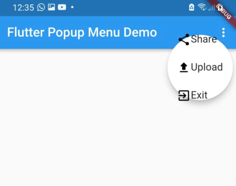
We can also make circular popup menu using this shape parameter. Like this.
PopupMenuButton(
    shape: const CircleBorder(),
    itemBuilder: (BuildContext context) {
      return [
        _buildPopupMenuItem('Share', Icons.share),
        _buildPopupMenuItem('Upload', Icons.upload_rounded),
        _buildPopupMenuItem('Exit', Icons.exit_to_app),
      ];
    })
Output
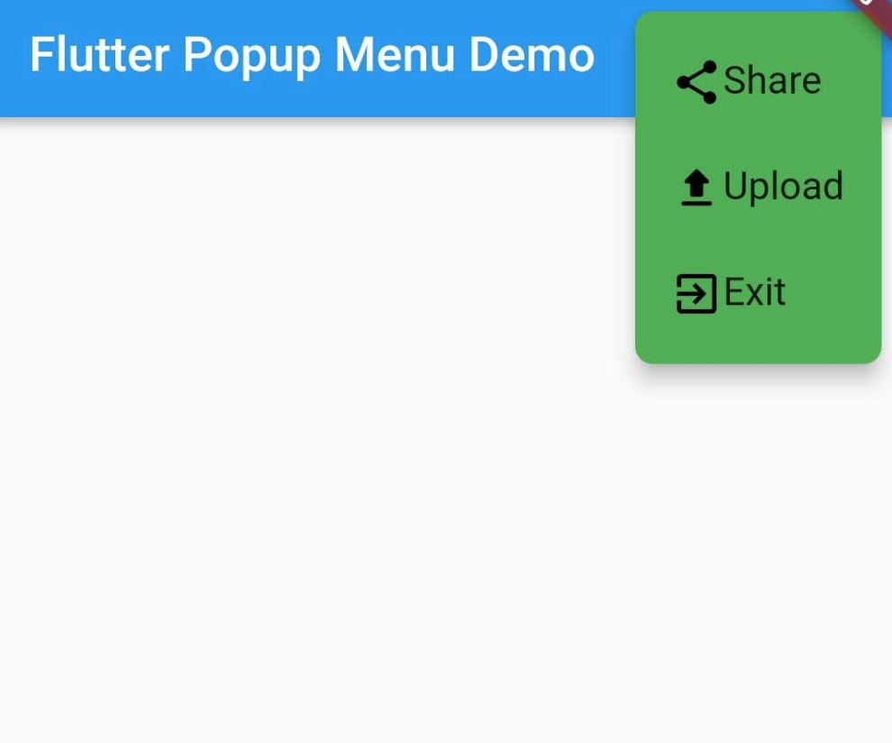
Change Color of Flutter Popup Menu
To change color of flutter popup menu we will use the color parameter of Flutter PopupMenuButton.
PopupMenuButton(
    shape: RoundedRectangleBorder(
        borderRadius: BorderRadius.circular(8)),
    color: Colors.green,
    itemBuilder: (BuildContext context) {
      return [
        _buildPopupMenuItem('Share', Icons.share),
        _buildPopupMenuItem('Upload', Icons.upload_rounded),
        _buildPopupMenuItem('Exit', Icons.exit_to_app),
      ];
    })
Output
Change elevation of Flutter Popup Menu
The elevation handles the shadow of widget. The constructor of Popup menu button contains a parameter of elevation. To add elevation in popup menu we will use elevation property.
PopupMenuButton(
  elevation: 20,
    shape: RoundedRectangleBorder(
        borderRadius: BorderRadius.circular(8)),
    color: Colors.green,
    itemBuilder: (BuildContext context) {
      return [
        _buildPopupMenuItem('Share', Icons.share),
        _buildPopupMenuItem('Upload', Icons.upload_rounded),
        _buildPopupMenuItem('Exit', Icons.exit_to_app),
      ];
    })
Click Listener on Flutter Popup Menu
This is the most important thing about the popup menu. We just have created popup menus of different types. It’s a just design. These are not functional yet. We want to perform an action when click on any one of these menus. To perform action, first we have to listen that which menu item is clicked. For this we will use the onSelected property of Flutter Popup menu button. And we also assign unique values to each popup menu item. So that we can distinguished that which popup menu item is selected.
PopupMenuButton(
  elevation: 20,
  shape:
      RoundedRectangleBorder(borderRadius: BorderRadius.circular(8)),
  itemBuilder: (BuildContext context) {
    return [
      const PopupMenuItem(
        child: Text('Share'),
        value: 1,
      ),
      const PopupMenuItem(
        child: Text('Upload'),
        value: 2,
      ),
      const PopupMenuItem(
        child: Text('Exit'),
        value: 3,
      ),
    ];
  },
  onSelected: (id) {
    if (id == 1) {
      // Perform action on click on share
    }
    if (id == 2) {
      // Perform action on click on Upload
    }
    if (id == 3) {
      // Perform action on click on Exit
    }
  },
)
Conclusion
In this simple tutorial we learn that how to create Flutter popup menu, and customise that menu. And learn the most important thing that how to handle click listener on it. This was very simple and take just a few lines of code.