
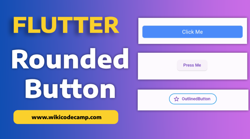
Three ways to create a rounded button in Flutter
Rounding buttons in apps is a design choice that serves both aesthetic and functional purposes.
Rounded buttons are often considered more visually appealing and can contribute to a softer, more friendly look in the user interface. The rounded corners create a sense of smoothness and can make the overall design feel more approachable.
From a functional standpoint, rounded buttons can enhance the user experience on touch devices. The curved edges make it more comfortable for users to tap on the buttons, reducing the likelihood of accidental taps on neighboring elements.
Round Button corners in Flutter
Implementing rounded buttons in Flutter is straightforward, thanks to the flexibility and simplicity of the framework. Developers can use the ElevatedButton or TextButton widgets and customize their appearance by adjusting properties such as borderRadius. Today, we will explore three techniques through which we can create rounded buttons in Flutter.
Method 1 : Elevated Button
ElevatedButton(
  onPressed: () {
    // Add button functionality here
  },
  style: ElevatedButton.styleFrom(
    shape: RoundedRectangleBorder(
      borderRadius: BorderRadius.circular(10.0),
    ),
  ),
  child: Text('Press Me'),
)
Output
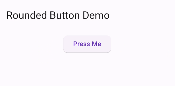
ElevatedButton.styleFrom(): This is a method provided by Flutter’s ElevatedButton widget. It allows us to define the visual style of the button.
shape: RoundedRectangleBorder(): Here, it specifies the shape of the button using a RoundedRectangleBorder. This means the button will have rounded corners.
borderRadius: BorderRadius.circular(10.0): Inside the RoundedRectangleBorder, this line sets the border radius to 10.0. This means that the corners of the button will be rounded with a circular radius of 10.0, giving it a smooth and rounded appearance.
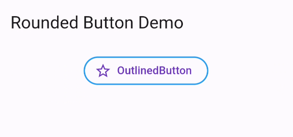
Method 2 : Outlined Button
We can also create rounded button by using OutlinedButton.
OutlinedButton.icon(
  icon: Icon(Icons.star_outline),
  label: Text("OutlinedButton"),
  onPressed: () => print("it's pressed"),
  style: ElevatedButton.styleFrom(
    side: BorderSide(width: 2.0, color: Colors.blue),
    shape: RoundedRectangleBorder(
      borderRadius: BorderRadius.circular(32.0),
    ),
  ),
)
Output
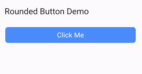
Method 3 : Container
We can simply use Container and use InkWell to get a custom button and also properties like onDoubleTap, onLongPress, etc.:
InkWell(
  onTap: () => print('hello'),
  child: new Container(
    //width: 100.0,
    height: 50.0,
    decoration: new BoxDecoration(
      color: Colors.blueAccent,
      border: new Border.all(color: Colors.white, width: 2.0),
      borderRadius: new BorderRadius.circular(10.0),
    ),
    child: new Center(child: new Text('Click Me', style: new TextStyle(fontSize: 18.0, color: Colors.white),),),
  ),
)
Output
You can also read how to change package name in Flutter
