

Stack and Indexed Stack in Flutter
What is stack widget
Stack is a widget in flutter that allows us to overlay multiple widgets each other. It is a multi child widget. It can be say that this widget is equivalent to Relative Layout in android. Because relative layout allows multiple layout components to align over each other. Here we can achieve this type of functionality with Stack Widget. In this article we will learn how to use stack and Indexed Stack widget in Flutter apps.
There are two main types of Stack in Flutter
- Stack
- Indexed Stack
Children Position in Stack Widget
Stack Widget class constructor takes a list of widgets as Column takes. The children of Column Widget do not overlap each other. They aligned vertically one afte
r each other. But children of Stack Widget overlap each other. If we pass an array of 5 children of same size in Stack Widget, we can only see the last widget of that array. Other 4 widgets will be hidden behind this 5th widget. Because the behavior of Stack widget is that it orders its children from bottom to top. The first child of Stack will be at the bottom and the last child will be at the top.
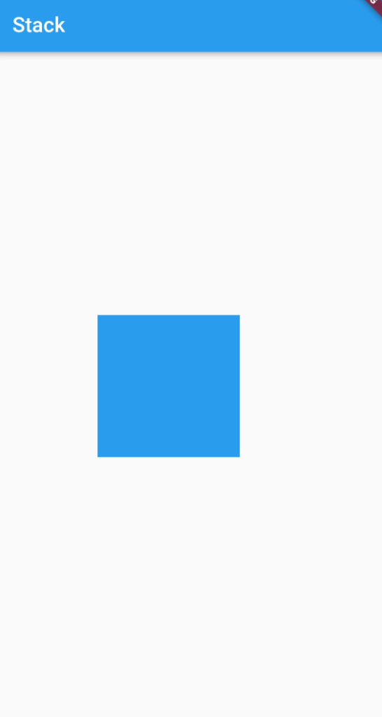
Stack(
  children: [
    Container(
      color: Colors.red,
      width: 100,
      height: 100,
    ),
    Container(
      color: Colors.blue,
      width: 100,
      height: 100,
    ),
    Container(
      color: Colors.green,
      width: 100,
      height: 100,
    ),
  ],
)
Output
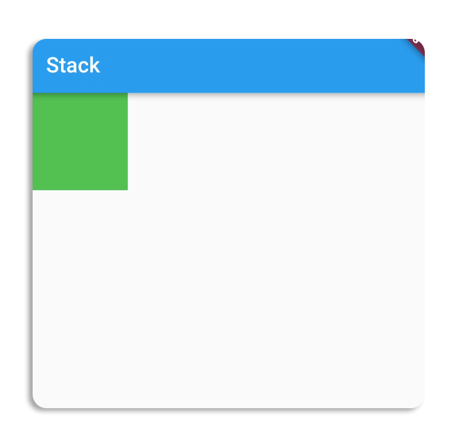
This is a simple stack. You can see that we have added three containers of same sizes in Stack but the only last one is visible (Which is green), other two are hidden behind that one.
Stack(
  children: [
    Container(
      color: Colors.red,
      width: 200,
      height: 200,
    ),
    Container(
      color: Colors.blue,
      width: 150,
      height: 150,
    ),
    Container(
      color: Colors.green,
      width: 100,
      height: 100,
    ),
  ],
)
Output
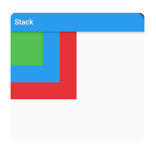
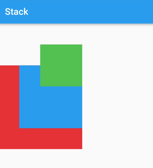
Here we have added three containers with different sizes. The first one container which is in red color is the largest container, So the stack box size is equal to the size of this conainer.
By default each child of Stack will be aligned at top left corner. But we can change its position by using Position Widget or Align Widget.
Size of Stack Box
Children of stack can be aligned relative to the edges of the Stack box, And Stack changes its size to fit its children in it. For example if the width of largest child of the Stack is 500, then the width of the Stack box will be 500 and same also with Height. Stack changes its width and height according to the largest child of it.
We can also change the Stack size by wrap the Stack with SizedBox or Container.
Properties of Stack Widget
Stack widget constructor takes these parameters.
Children
Stack class takes this argument. Its type is List<Widget>. This is an array of widgets that we want to show in Stack. Stack will render these widgets. The order of children will be from bottom to top. The first element of list will be at the bottom and the last element of list will be at top of Stack.
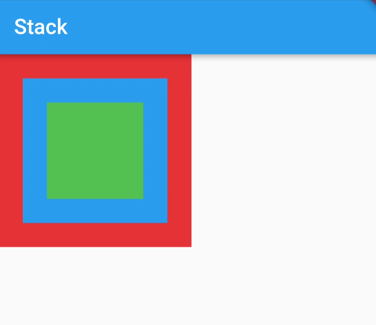
Alignment
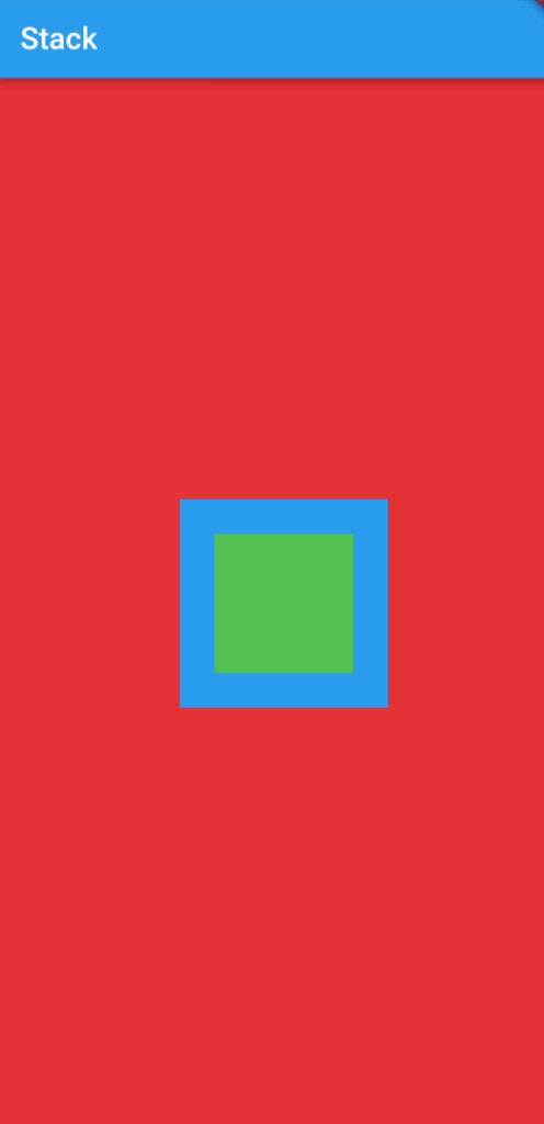
This property of Stack is used to set the position of Non-Aligned children of Stack. All the Non-Aligned children will follow this property. For example if we set this alignment at center, All the children will be aligned at center of Stack.
Stack(
  alignment: Alignment.center,
  children: [
    Container(
      color: Colors.red,
      width: 200,
      height: 200,
    ),
    Container(
      color: Colors.blue,
      width: 150,
      height: 150,
    ),
    Container(
      color: Colors.green,
      width: 100,
      height: 100,
    ),
  ],
)
Output
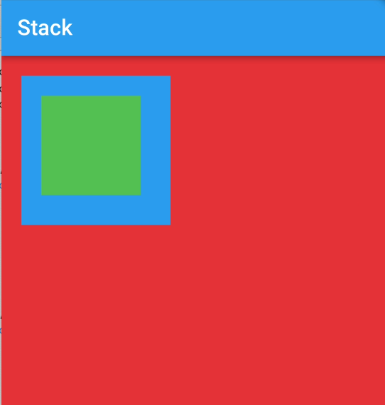
TextDirection
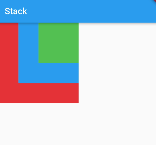
TextDirection property is used to set the starting point of children in Stack. We will assign the TextDirection enum to this property. The default value of this property is Right to Left. Its mean by default Stack aligned its children at top left corner. If we set this property to TextDirection.rtl (Right to Left), It will align its children at top right corner.
Stack(
 textDirection: TextDirection.rtl,
  children: [
    Container(
      color: Colors.red,
      width: 200,
      height: 200,
    ),
    Container(
      color: Colors.blue,
      width: 150,
      height: 150,
    ),
    Container(
      color: Colors.green,
      width: 100,
      height: 100,
    ),
  ],
)
Output
Clip Behaviour
This property of Stack tells helps to cut off the overflown children that are exceeds the size constraints of stack. For example the height of the Stack is 200 and its child height is 250. Then it will overflow the constraints of Stack. By passing this property in Stack constructor you can handle this overflow. The value you will use to handle this is Clip. The default is Clip.hardEdge, Which clips the overflown children. To avoid the clipping we will change Clip.hardEdge to Clip.none, Which not clip the children of stack.
Clip With HardEdge
Container(
  margin: EdgeInsets.only(top: 100),
  child: Stack(
    clipBehavior: Clip.hardEdge,
   textDirection: TextDirection.rtl,
    children: [
      Container(
        color: Colors.red,
        width: 200,
        height: 200,
      ),
      Container(
        color: Colors.blue,
        width: 150,
        height: 150,
      ),
      Positioned(
        top: -50,
        child: Container(
          color: Colors.green,
          width: 100,
          height: 100,
        ),
      ),
    ],
  ),
)
Output

Clip with Clip.none
clipBehavior: Clip.none,Output
These are the common properties. More you can see here
How to align children in Stack?
Children of Stack can be aligned with the use of two Widgets. First Widget is Align, and second one is Positioned.
1-Align
Using this widget we can align the children of Stack with in the area of stack, relative to its boundaries. For example if the Stack is filled on complete screen because its largest child covers the full screen. Now we want to align the second child at top right corner rather than its default position (Top Left Corner). We will use Align Widget.
Stack(
  children: [
    Container(
      color: Colors.red,
      width: double.infinity,
      height: double.infinity,
    ),
    Align(
      alignment: Alignment.center,
      child: Container(
        color: Colors.blue,
        width: 150,
        height: 150,
      ),
    ),
    Align(
      alignment: Alignment.center,
      child: Container(
        color: Colors.green,
        width: 100,
        height: 100,
      ),
    ),
  ],
)
Output
As you can see the child is at top right corner instead of the left corner. We have changed the alignment of child using Align Widget. Using Align Widget we can align the child of Stack at different positions.
2-Positioned
While we have aligned our child of Stack using Align Widget, then why we use Positioned Widget?
As you can see that the child widget of Stack is at extreme positions of Stack. There is not margin or padding at top and right sides. Which is not looking so good. So if we want some padding on these edges then we have to use the Positioned Widget. The Positioned Widget will add padding there. Let’s see how it will?
Positioned class also contains properties. These properties tells the position and dimensions of child widget in Stack. Child property is required. We must have to pass a child in it. Other properties are top, left, right, bottom, height and width. These properties set position and dimension of its child. For example if we give value 20.0 to top property, then its child will be positioned 20.0 away from the top edge.
Stack(
  children: [
    Container(
      color: Colors.red,
      width: double.infinity,
      height: double.infinity,
    ),
    Positioned(
      top: 20,
      left: 20,
      child: Container(
        color: Colors.blue,
        width: 150,
        height: 150,
      ),
    ),
    Positioned(
      top: 40,
      left: 40,
      child: Container(
        color: Colors.green,
        width: 100,
        height: 100,
      ),
    ),
  ],
)
Output
As you can see here that now the child of Stack has paddings on its top and left edges.Here we give value of top and right, Which means that it will take margin from top edge and left edge. For this purpose we used Positioned widget because we cannot avail this using Align Widget.
What is indexed stack?
Indexed stack is also like the stack. The main difference in these is that Stack shows all of its children at the same time. But Indexed stack shows only one children at one time, other children will not be visible. We will handle the visibility of child widgets by the index parameter of IndexedStack constructor.
Code
IndexedStack(
  index: 0,
  children: [
    Container(
      color: Colors.red,
      width: 200,
      height: 200,
    ),
    Container(
      color: Colors.blue,
      width: 150,
      height: 150,
    ),
    Container(
      color: Colors.green,
      width: 100,
      height: 100,
    ),
  ],
)
Output

Conclusion
In this tutorial we learned about Stack in Index stack in detail, and walk through some examples with code to deeply understand. Hope it will be helpful for you to understand functionality of Stack and IndexedStack, and the difference between them.
Thank you for reading.