2 Ways to decorate a Dropdown Button In Flutter
In Flutter, decorating a Dropdown Button serves several purposes, including enhancing user experience, improving aesthetics, and ensuring consistency within the app’s design. In this tutorial we will see the two ways to decorate a Dropdown Button in Flutter.
By customizing the appearance of the Dropdown Button, developers can align its design with the overall theme and branding of the application. This consistency in visual elements enhances the app’s professional look and feel.
Decorative elements such as color, padding, and animations can make the Dropdown Button more visually appealing and user-friendly. Clear and attractive dropdowns can guide users effectively, reducing confusion and improving the overall user experience.
Decorate Dropdwon in Flutter
We can decorate a dropdown button in Flutter by two ways.
Mehtod 1 : Decorate Dropdown Using DropdownButtonFormField
DropdownButtonFormField is a form field version of the dropdown button that provides built-in validation and error handling features, making it suitable for use within forms.
In Flutter, InputDecoration is a class used to customize the visual appearance of input widgets, such as TextField, DropdownButtonFormField, and similar form fields. When applied to a DropdownButtonFormField, InputDecoration allows you to define various styles for the dropdown button, including border, labels, hint text, error messages, and more.
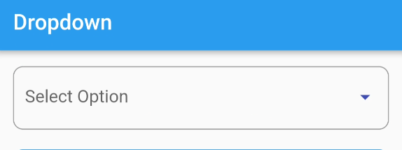
Let’s see how to decorate Dropdown using DropdownButtonFormField.
Code
DropdownButtonFormField(
    decoration: const InputDecoration(
      border: OutlineInputBorder(
        borderRadius: BorderRadius.all(
          Radius.circular(10.0),
        ),
      ),
    ),
    iconEnabledColor: Colors.indigo,
    value: selectedItem,
    hint: const Text('Select Option'),
    items: const [
      DropdownMenuItem(
        child: Text('Option A'),
        value: 1,
      ),
      DropdownMenuItem(
        child: Text('Option B'),
        value: 2,
      ),
    ],
    onChanged: (item) {
      setState(() {
        selectedItem = item as int;
      });
    }),
Output

Method 2 : Decorate Dropdwon Using DecoratedBox
In Flutter, DecoratedBox is a widget that applies a decoration to its child, which can be another widget or a tree of widgets. The Decoration class in Flutter allows you to customize the appearance of graphical elements, such as boxes, borders, shadows, and backgrounds.
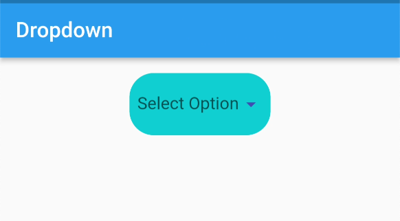
Let’s see how to decorate Dropdown Button using DecoratedBox.
Code
DecoratedBox(
  decoration: const ShapeDecoration(
    color: Colors.cyan,
    shape: RoundedRectangleBorder(
      side: BorderSide(
          width: 1.0,
          style: BorderStyle.solid,
          color: Colors.cyan),
      borderRadius: BorderRadius.all(Radius.circular(25.0)),
    ),
  ),
  child: Padding(
    padding: const EdgeInsets.all(8.0),
    child: DropdownButton(
        underline: const SizedBox(),
        iconEnabledColor: Colors.indigo,
        value: selectedItem,
        hint: const Text('Select Option'),
        items: const [
          DropdownMenuItem(
            child: Text('Option A'),
            value: 1,
          ),
          DropdownMenuItem(
            child: Text('Option B'),
            value: 2,
          ),
        ],
        onChanged: (item) {
          setState(() {
            selectedItem = item as int;
          });
        }),
  ),
),
Output

You can also read two ways to change arrow color of dropdown


